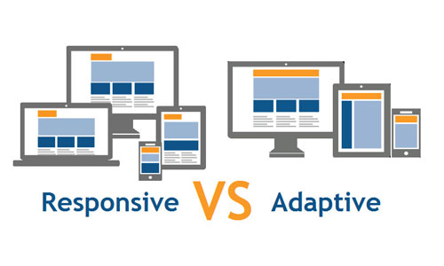
Difference Between Responsive Vs. Adaptive Web Design
One of the hottest issues in web developer circles this year is accessibility of websites on various devices other than the standard desktop or laptop screens. While the subject is not new, it has taken on a relatively new approach with respect to how to deal with the opportunities ahead.
Users who access your websites through their mobile devices or other display screens really do not care what method you use, just as long as that they can effectively navigate your website on whatever device they happen to be using. For that reason, the two methods described in this article have been devised for web developers to meet the challenge, and while responsive (RWD) and adaptive (AWD) design methods are both addressing the issue for rendering websites on mobile devices, there are subtle differences between them that I will attempt to explain.
With mobile devices, tablets, and similar gadgets gaining ground faster than most can keep up, it behooves organizational stakeholders to address the issues encompassing user interactions and acceptance of their websites on the latest diminutive gizmos. Oh, and don't forget other devices acquiring web-enabled screens such as refrigerators, washing machine,s and other everyday appliances.
Responsive Web Design:
A responsive web design is that it will fluidly change and respond to fit any screen or device size. The phrase Responsive Web Design was coined several years ago by Ethan Marcotte and first introduced in his A List Apart article, "Responsive Web Design" and later, his book, A Book Apart - Responsive Web Design. Marcotte's key points of RWD are listed below. In my post on the subject, "How to get started with Responsive Web Design," I described how a responsive website design starts with the primary task of incorporating CSS3, media queries, the @media rule, and fluid grids that use percentages to create a flexible foundation. These key points, as well as the use of EMs, flexible images, flexible videos, and fluid type, allow the responsive website to adapt its layout to the viewing device, user agent, and environment.
Adaptive Web Design:
The term was first coined by Aaron Gustafson in his book "Adaptive Web Design: Crafting Rich Experiences with Progressive Enhancement" in May 2011. It is a high level design philosophy that can be achieved through a variety of execution tactics including server side user agent detection, or client side responsive web design.
The three layers of Progressive Enhancement:
- Content layer = rich semantic HTML markup
- Presentation layer = CSS and styling
- Client-side scripting layer = JavaScript or jQuery behaviors.


